A landing page is one of the most essential and important assets of your website. It helps you to showcase specific product, Explain your service, collect leads, sell products and what not.
But are you able to convert more leads to your landing page?
If no, then this article is for you which will answer the following question.
- How to make a customer specific landing page?
- What are the things to consider before building a landing page?
We can discuss all but the 1st thing to understand is
“The customer only leaves contact info, buy the product, or interact with the webpage if the content available on the webpage is helping in one or another way.“
for any reason, if the visitor is not convinced then he will leave your webpage immediately and look for other alternatives.
So what are all “those things” customer need when they visit your landing page?
Everything a customer needs to know before they make a purchase. Most importantly how the product is going to benefit them in real life.
Is it going the o solve a real problem?
Is the landing page content taking the customer in the right direction?
Is the price of the product available?
Or you have just developed a landing page and burning money on advertisement and targeting a huge audience and waiting for people to buy your product.
Sadly that is not going to happen.
So How to build the right landing page?
Creativity has no bounds and I would rather prefer to answer How not to build a landing page and than telling you to build a landing page.
Mistakes you are doing designing a landing page
1. Making a Long Long Long landing page

A landing page is a page where customers land to know more about the product, get a free ebook, purchase a product.
But many digital marketing and web designers and making it too complicated by designing it in a boring fashioned.
Long Landing Page May Convert, But a Good landing page does convert.
What if the product has a lot of important features to be discussed?
There is always a better way to solve a problem creatively, so when you have a product or service which has a lot of features then make a video and put on the landing page, create an important feature list and put at the beginning of landing page.
For Example: If i offer you a free course and give you 2 option to learn in.
- By reading 8000+ word article
- By watching the course video
Which one will you select?
The first one! Probably no!
Why? Because video is easy to understand, everything keeps moving and learn more in less time. Videos are less boring than the text written on a webpage. You pay more attention when a person speaks in front of you. So the key here is to make your landing page short and simple.
2. Too Many CTA buttons
CTA: Call To Action buttons are important but what is more important on a landing page is to keep your customer focused on the benefit and leave no reason to let the customer exit. Placing too many calls to action buttons leave a suspicious though in customer’s brain and forms a denying pattern which makes customer exit from your landing page.
“The more call to action button you have a landing page the More conversion”
This is what wishpond said about too many calls to action buttons

So make your landing page appear good and authentic, use right color combinations, use visitor friendly images and proper CTA buttons.
You are bragging “Buy it now”, “Buy It Now” again and again
A mature marketer never pushed visitors to buy the product rather he focuses on sharing how it can be useful. A well-designed landing page will have a simple call to action button, proper description to purchase the product.
3. Your landing page design looks suspicious
Have you ever got SMS from an unknown number claiming “you got which declared you won 30,000$” and when you went to the website it was just a landing page asking your content details?
Can you believe such landing pages and leave your contact details, i believe no.
So if you cannot leave your contact on those types of landing pages then why to design such pages which can get visitors but will not convert any.
4. Using Poor Content
Once the user successfully lands on your webpage what he starts consuming?
The content! The content on the website plays a big role, and it should be grammatically correct and focused to the problem you are solving.

#5 You are not adding value

when I say value in a landing page, it is the value in your product, explaining the problem and solution of it.
You should be differentiating how the old method is time taking process and how your tool/product/service can do it in just a few hours/minutes and make the whole process easy.
Adding screenshots from the real-time examples, not fake ones would be a great way to covey people.
Again don’t take anyone and start making a video, take a recognized face considering your budget.
Explaining the whole process in the video may be time taking but it creates a lot of trust in customer mind.
#6 Unable to explain your product
No one will buy your product if you do not explain thein the product clearly. You are not able to convince visit us while we should buy your product.
Convincing starts from the very basic level of your marketing, from adding a right title to right content to putting a right call to action in ads.
See analytics and read user behavior
If a visitor has landed from social media, the conversion will be less.
If it has landed from organic search traffic, then that means the customer is interested in what you are selling.
#7 Not having a proper measure

It is recommended to have a system where you track all the leads can be connected to a regular interval.
If you are not connecting with your subscribers, soon they will forget you.
Connecting with subscribers is not just limited to regular emails but also the other mediums.
The more you be connected with people with authority the more people will trust you and likely to purchase what you are selling.
User’s are shifting towards visual content, don’t loose oppotunity to secure your audience.
The visual industry has got so far, every minute more than 600 hours of videos are being uploaded to youtube. It is only being uploaded because the audience is consuming.
#8 Boring Landing Page

2 second is the time in which your visitors decide if he should explore more. Design the first fold of the website in the way people don’t exit immediately.
#9 Confusing CTA Buttons
Does this image look familiar? You might have seen similar web pages with o many calls to action buttons which is absolute “a good example of a bad landing page”

The call to action button should be focused, a slightly bigger in size and easily accessible without any confusion. Doing this not just improves the CTR and Conversion but also the user experience.
A good example of a focused landing page is google.

It does have 2 calls to action buttons but it is pretty much focused and people never confuse using them.
Grabbing attention in first 2 seconds reduces Bounce rate as user stays on the webpage.
#10 Having date, very old date in URL of landing page

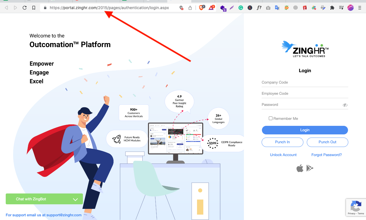
This is the homepage of ZingHR. A company that has focused on hiring 100s of sales people to sell their HR suite. They have ledt the date in URL and it creates a trust issue to the customer. This should always be avoided because customer gets a though “Am I getting an old product” while the landing page will continue to boast “new tech adaption”.
So those were the 10 mistakes you should not make while designing a landing page. What other mistakes you have been making, let me know in the comment section below.
